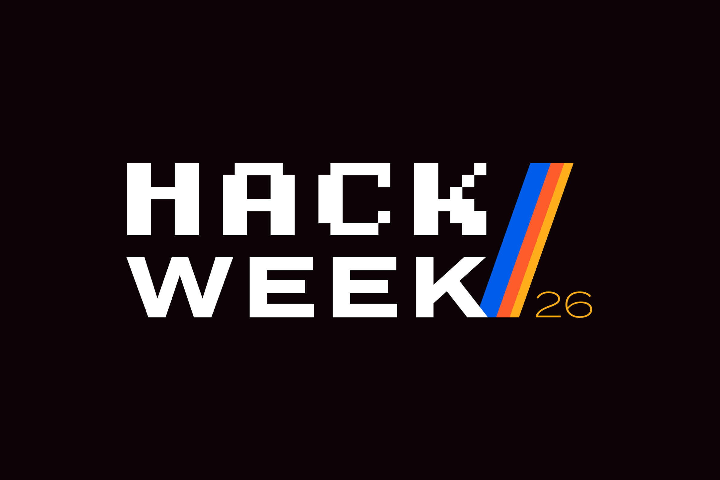
Translating an established creative vision into an immersive, production-ready event experience.
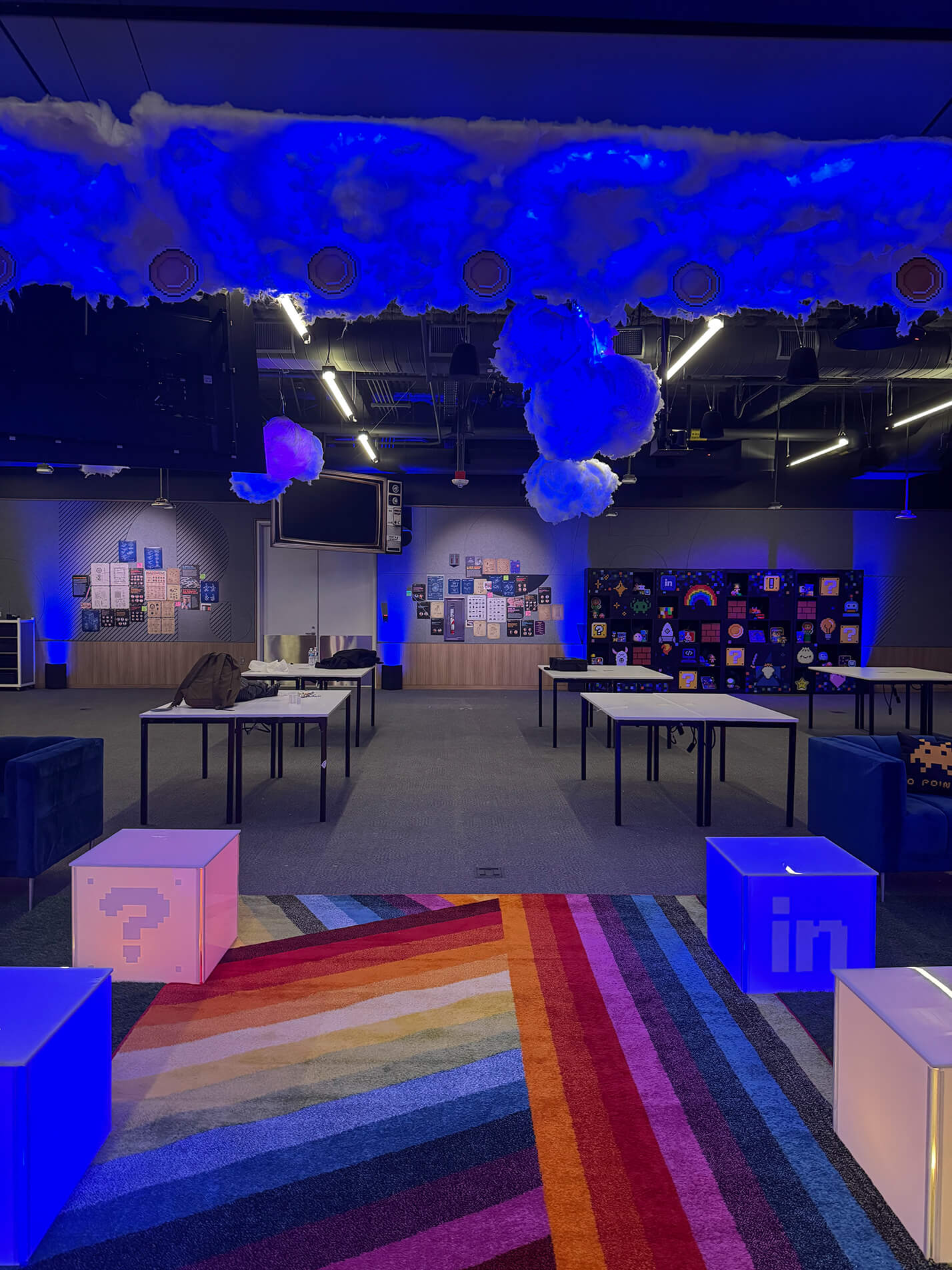
Working within an established creative direction, the challenge was to extend the Hack Week identity across a wide range of experiential, environmental, and digital assets while maintaining consistency, quality, and production accuracy throughout a fast-paced collaborative process.


Translate the established visual identity across every touchpoint.

Work within a multidisciplinary creative team to execute a shared vision.

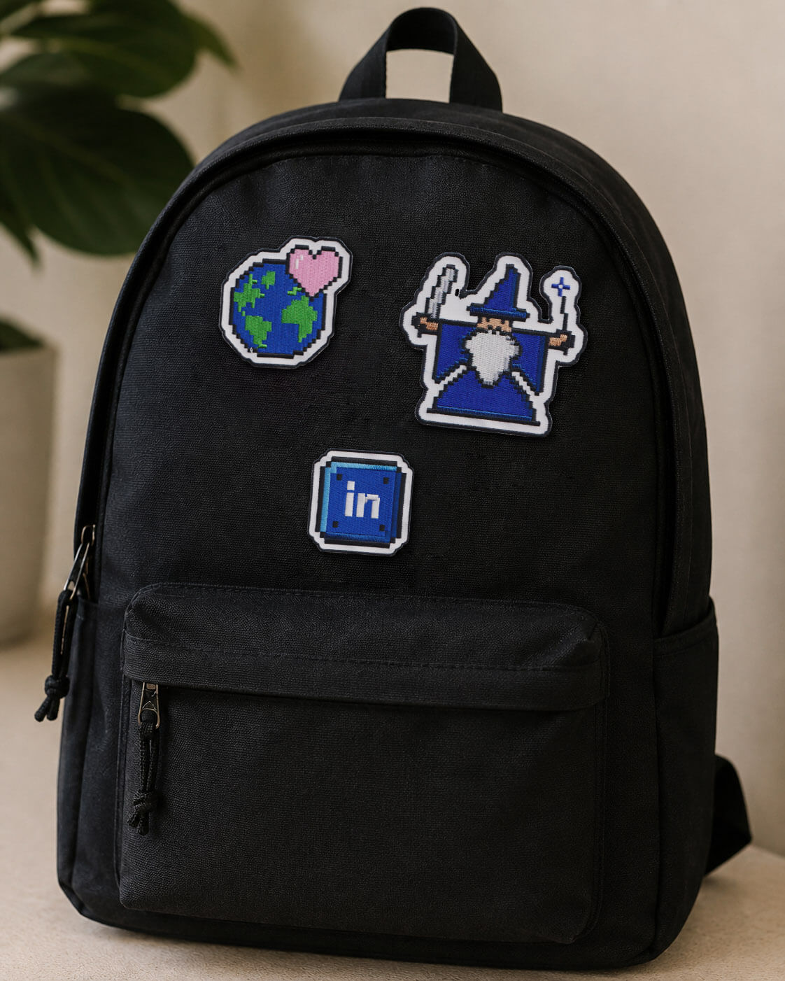
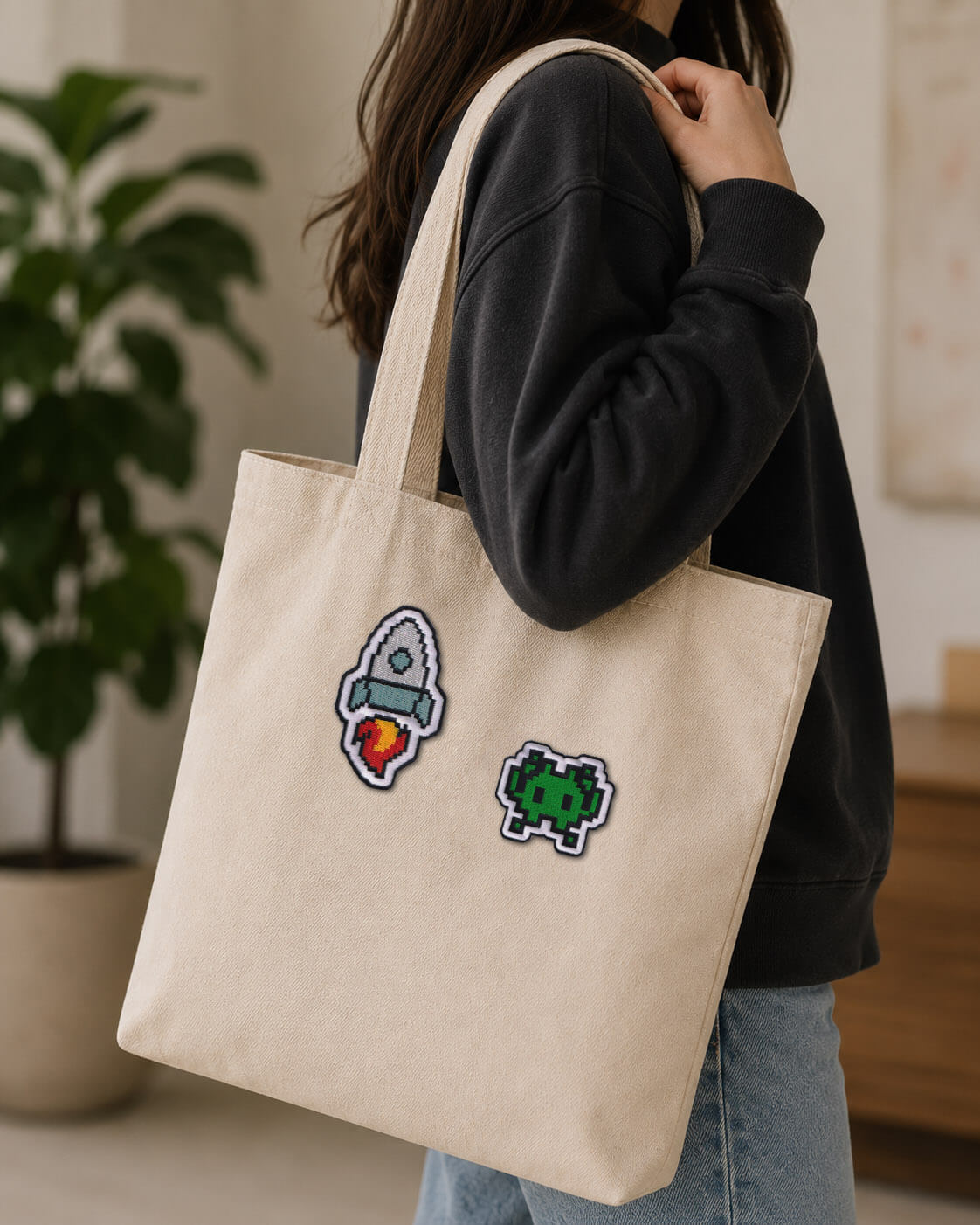
Create scalable, production-ready assets for print, digital, merchandise, and environmental applications.

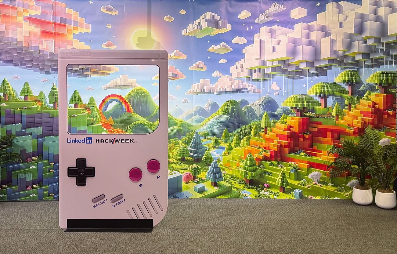
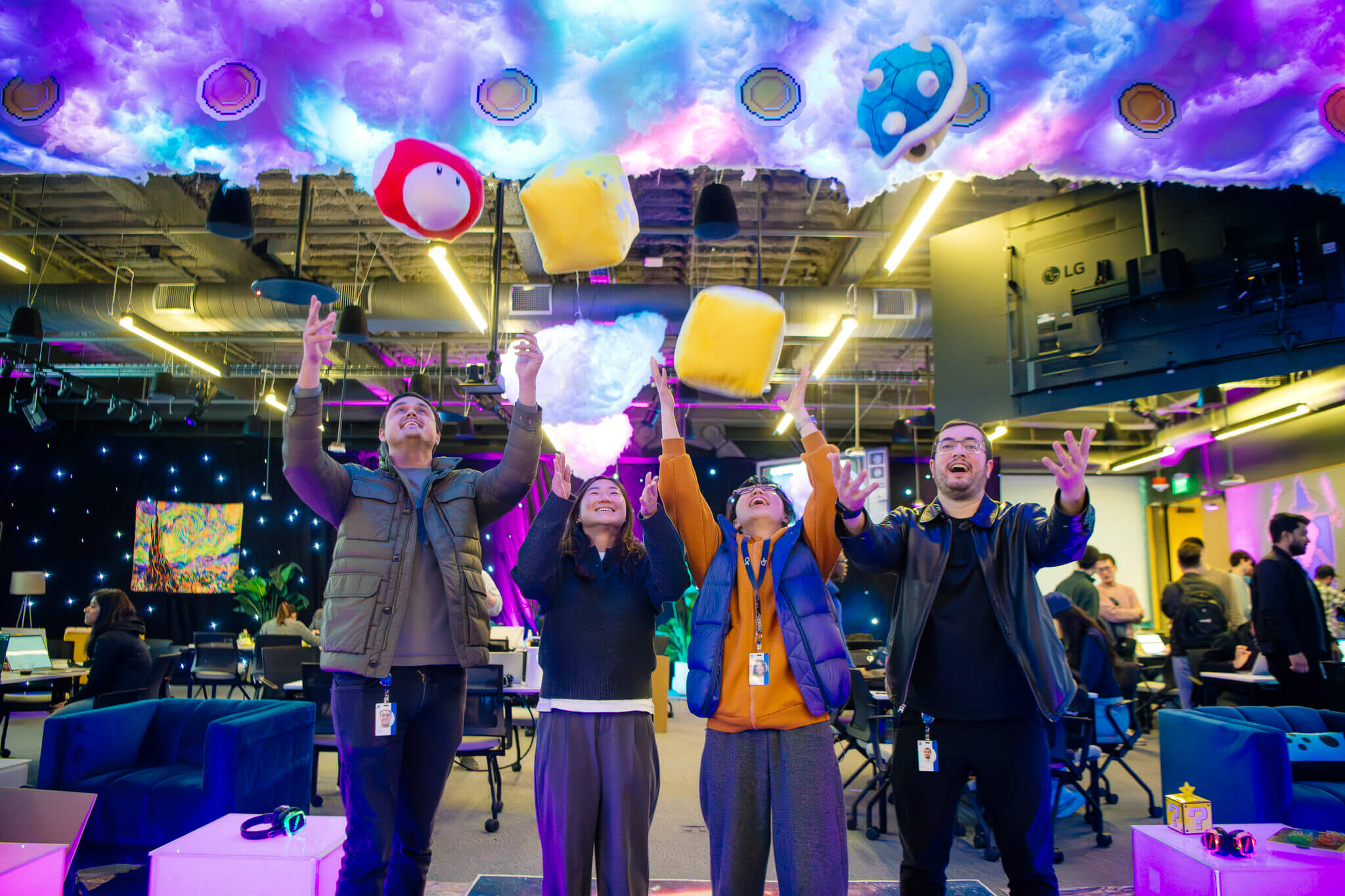
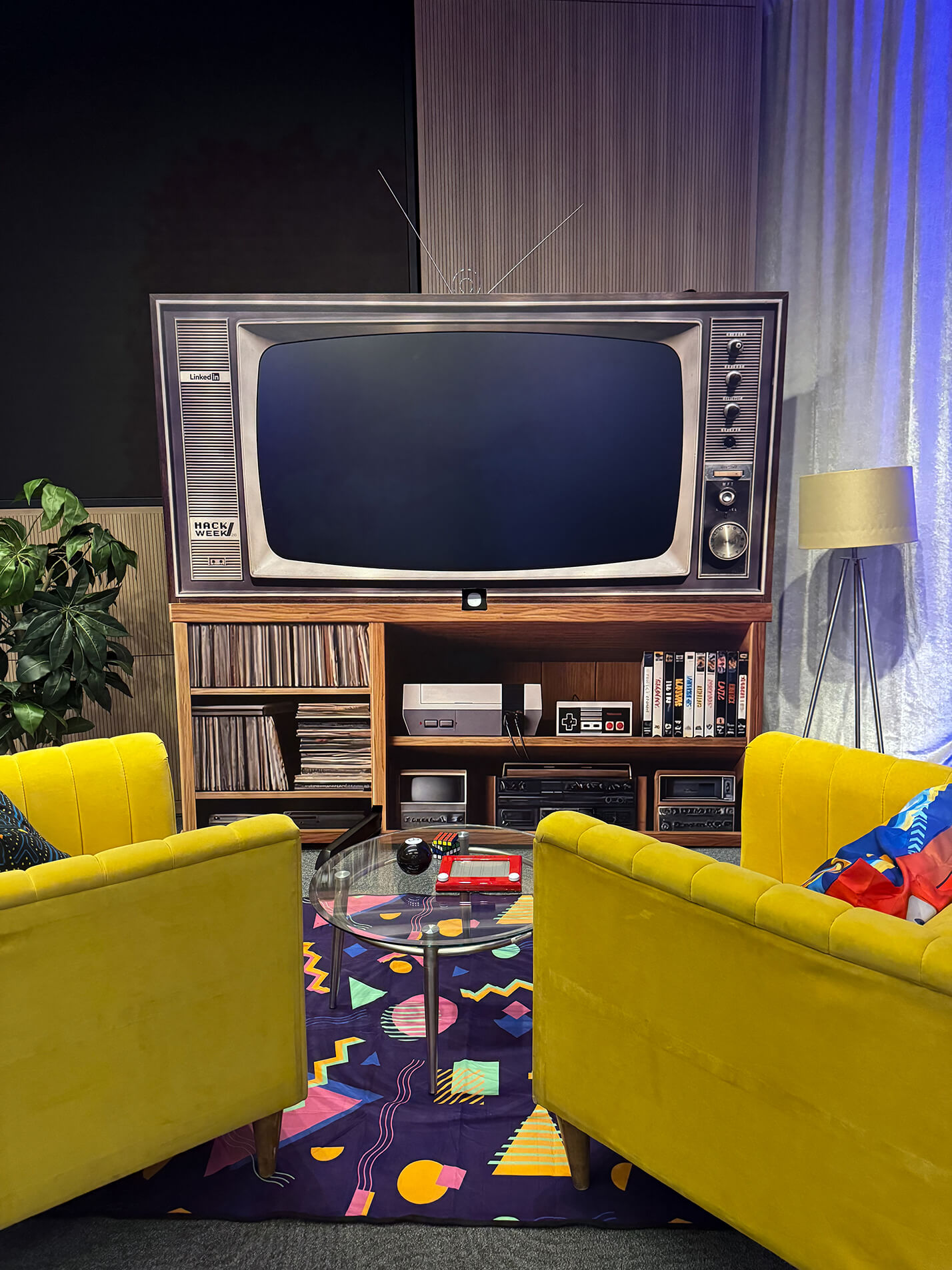
Develop graphics that strengthened the immersive Hack Week experience while supporting event programming.
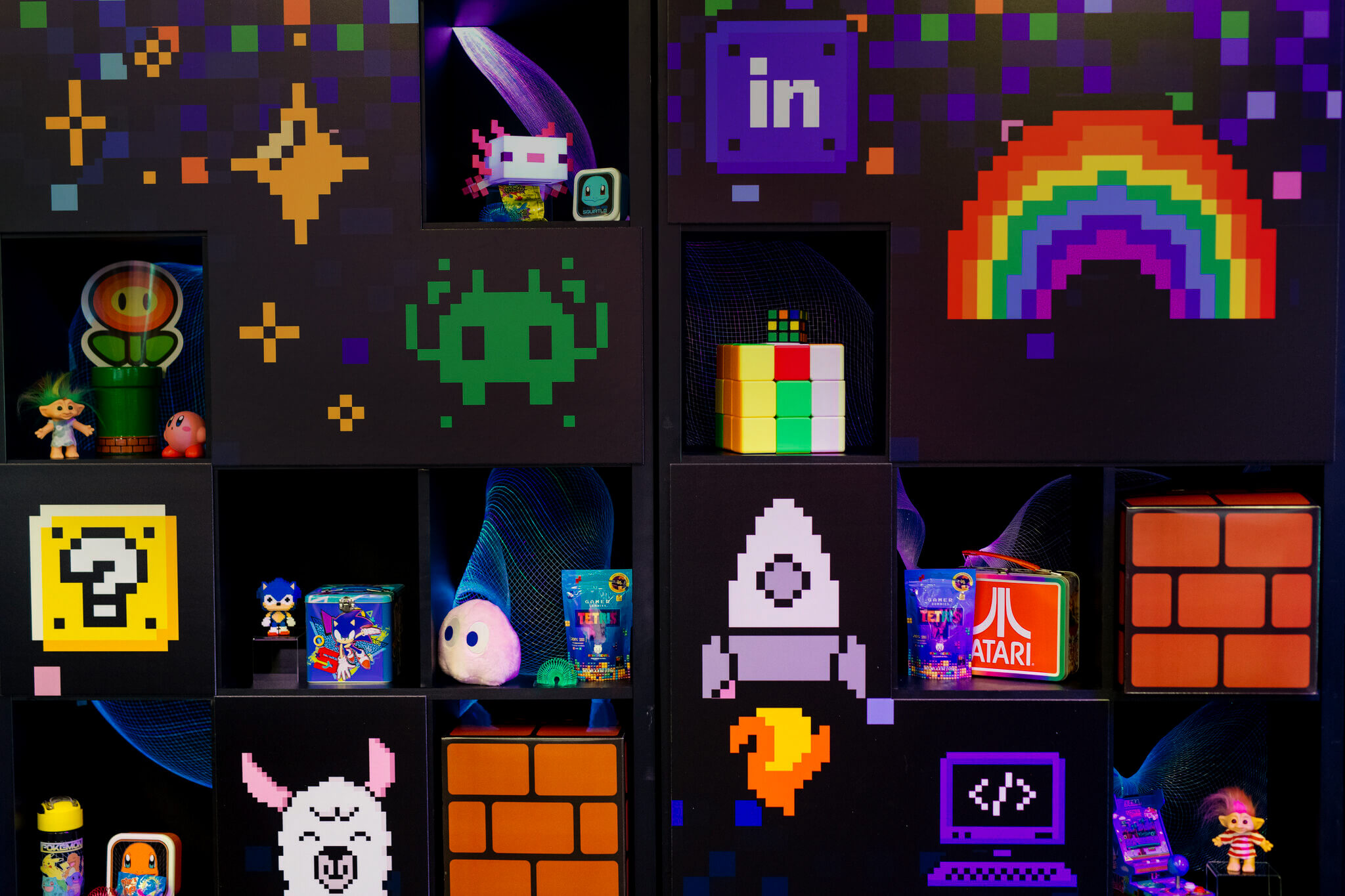
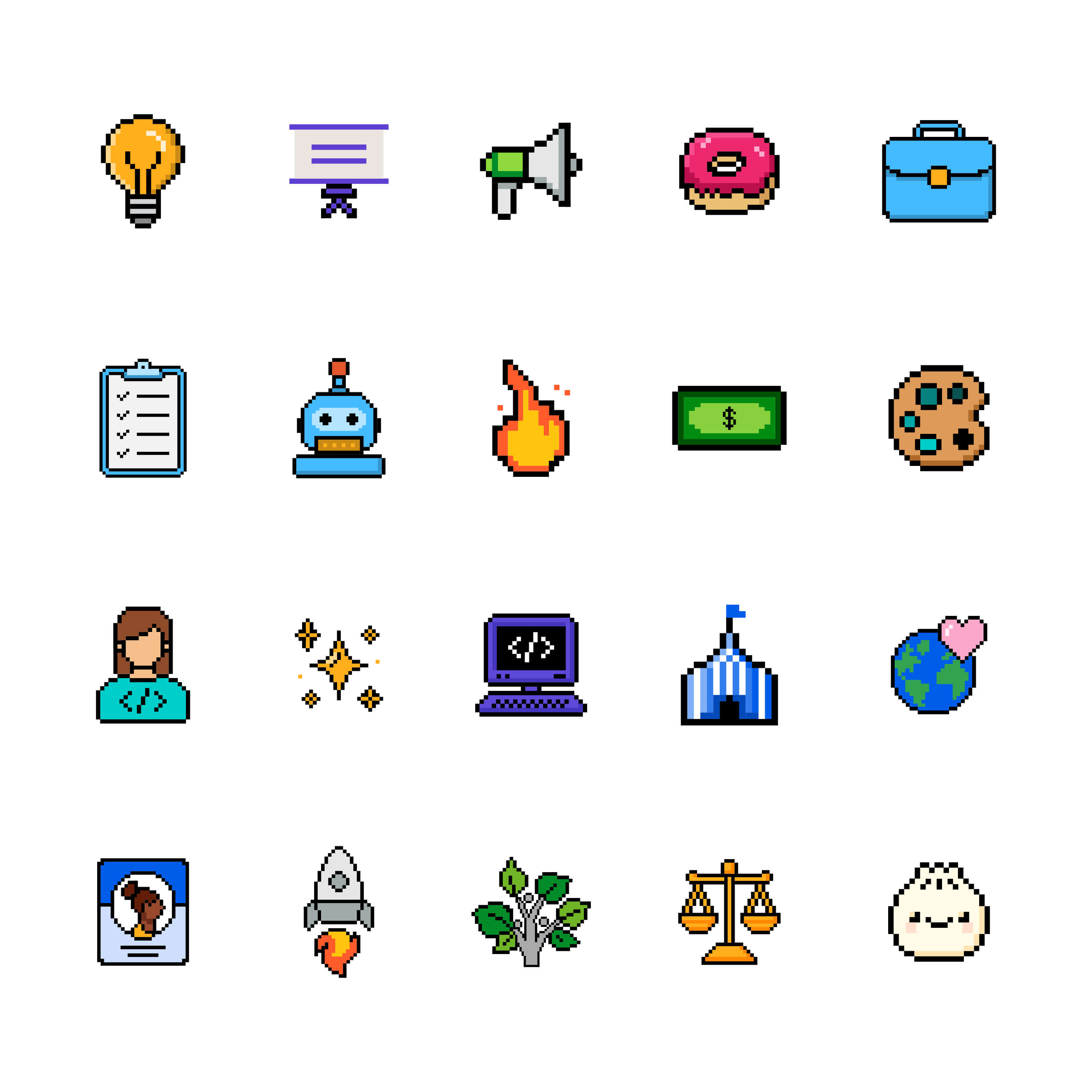
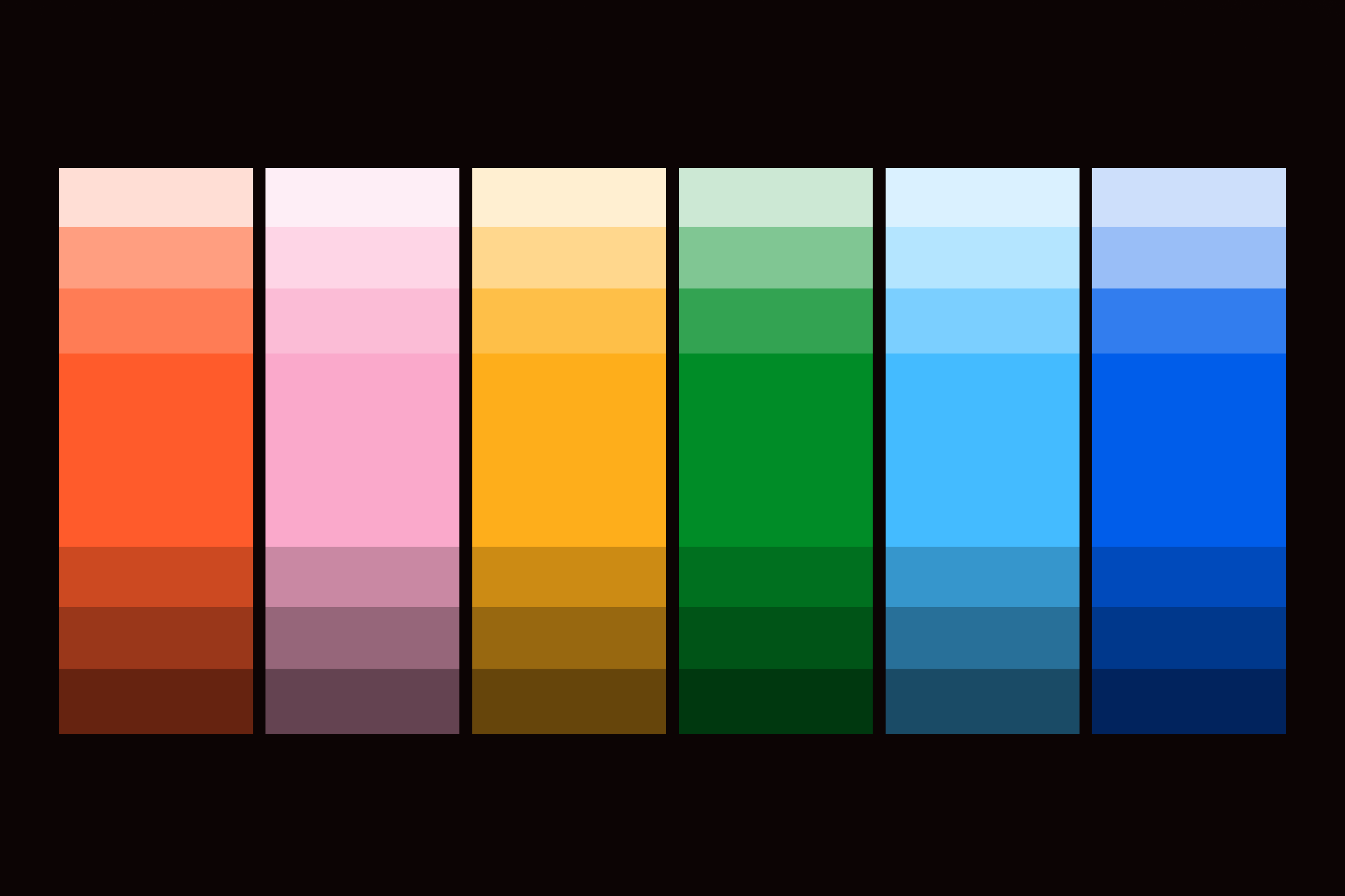
LinkedIn provided the foundational visual identity, including the logo, color palette, iconography, and creative direction. Working as part of the Hartmann Studios team, I expanded this established design system into a cohesive suite of production-ready assets that brought the Hack Week experience to life across environmental, digital, and branded touchpoints.
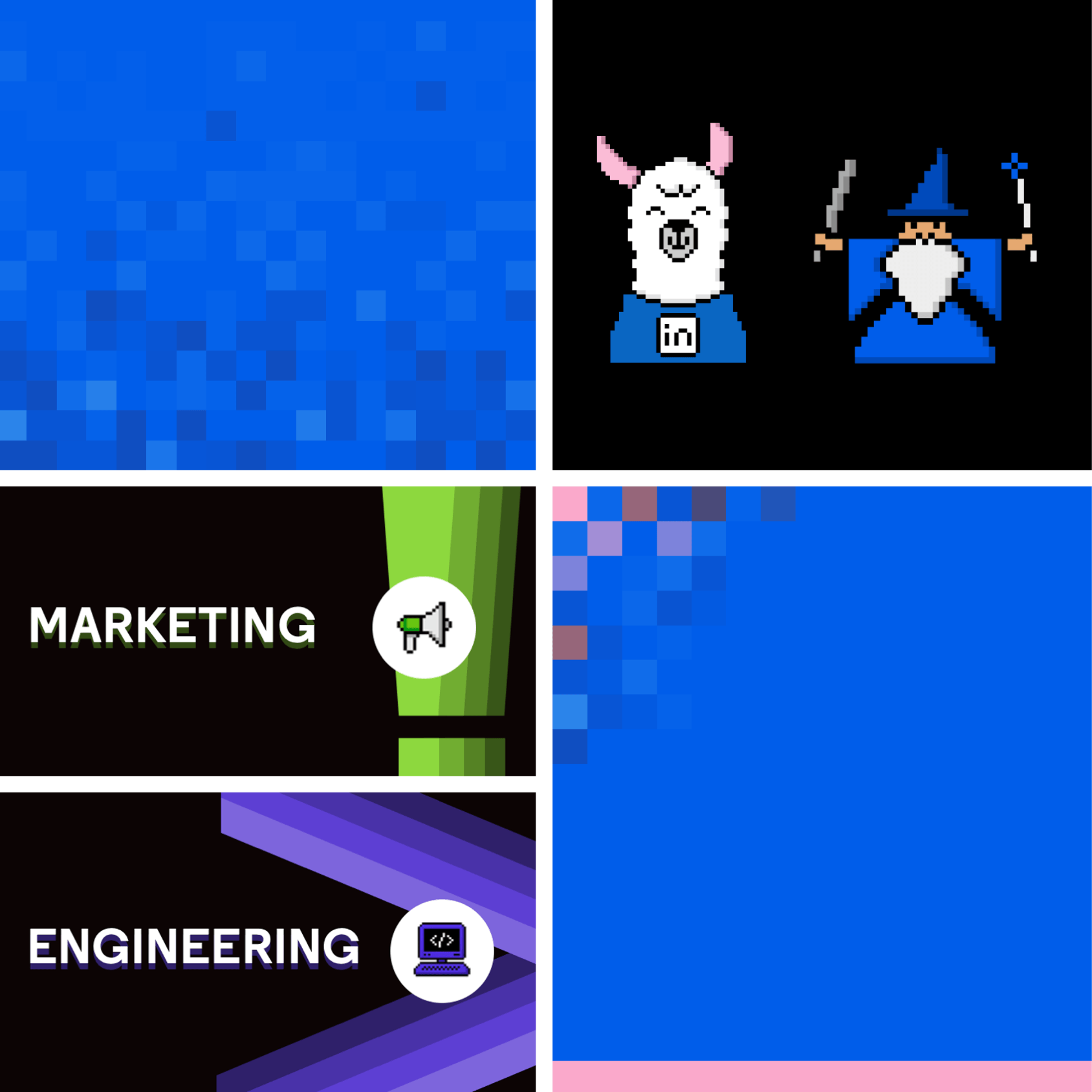
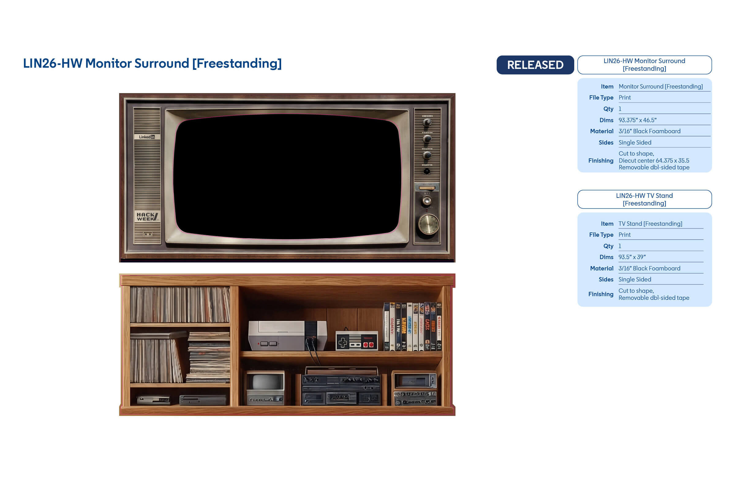
Each environmental graphic was documented within a comprehensive signage book, pairing print-ready artwork with fabrication specifications and installation details. This production-first approach ensured every final installation accurately reflected the intended creative vision.
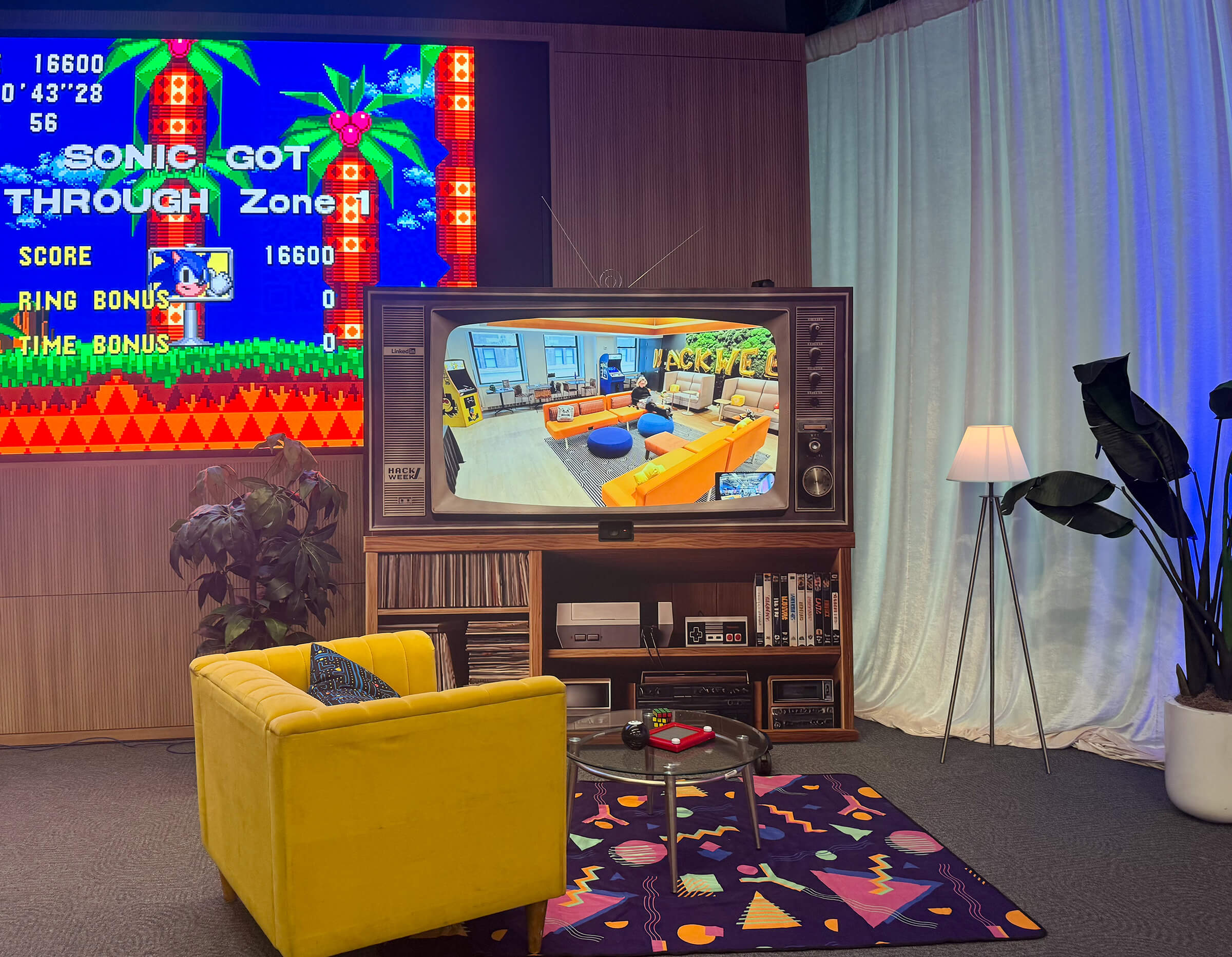
From custom environmental graphics and scenic elements to interactive photo opportunities and branded activations, each piece contributed to a cohesive event experience that celebrated creativity, collaboration, and innovation.