A distinctive real estate identity designed beyond the expected.
Fine & Coastal Real Estate began with a simple brief: create a distinctive real estate brand built around the company name and a preference for the color jade. With the rest of the visual direction left open, I developed an identity that avoided the expected cues of coastal real estate in favor of something modern, refined and memorable.
Rather than relying on waves, homes or other coastal clichés, I made the ampersand the visual hook of the identity. Breaking the mark into individual lines introduced movement and created a distinctive element that could extend across the brand. Starting with the requested jade, I built out the palette with complementary goldenrod, a rich plum accent and turquoise for a lighter expression.
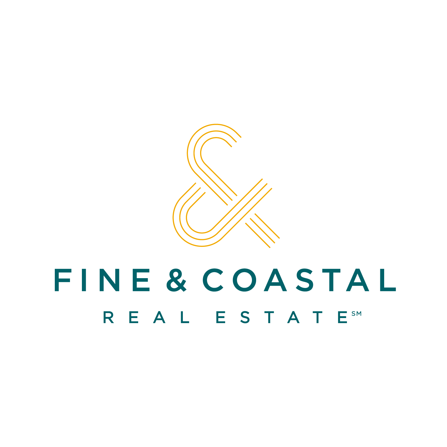


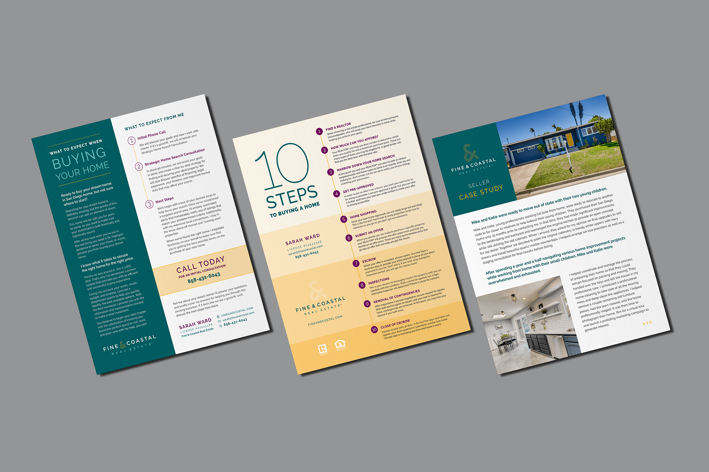
The ampersand expanded beyond the logo into patterns and graphic details, creating a flexible visual language across stationery, business cards and other brand applications. Color, typography and repeating linework allowed each piece to feel distinct while remaining clearly connected to the larger identity.


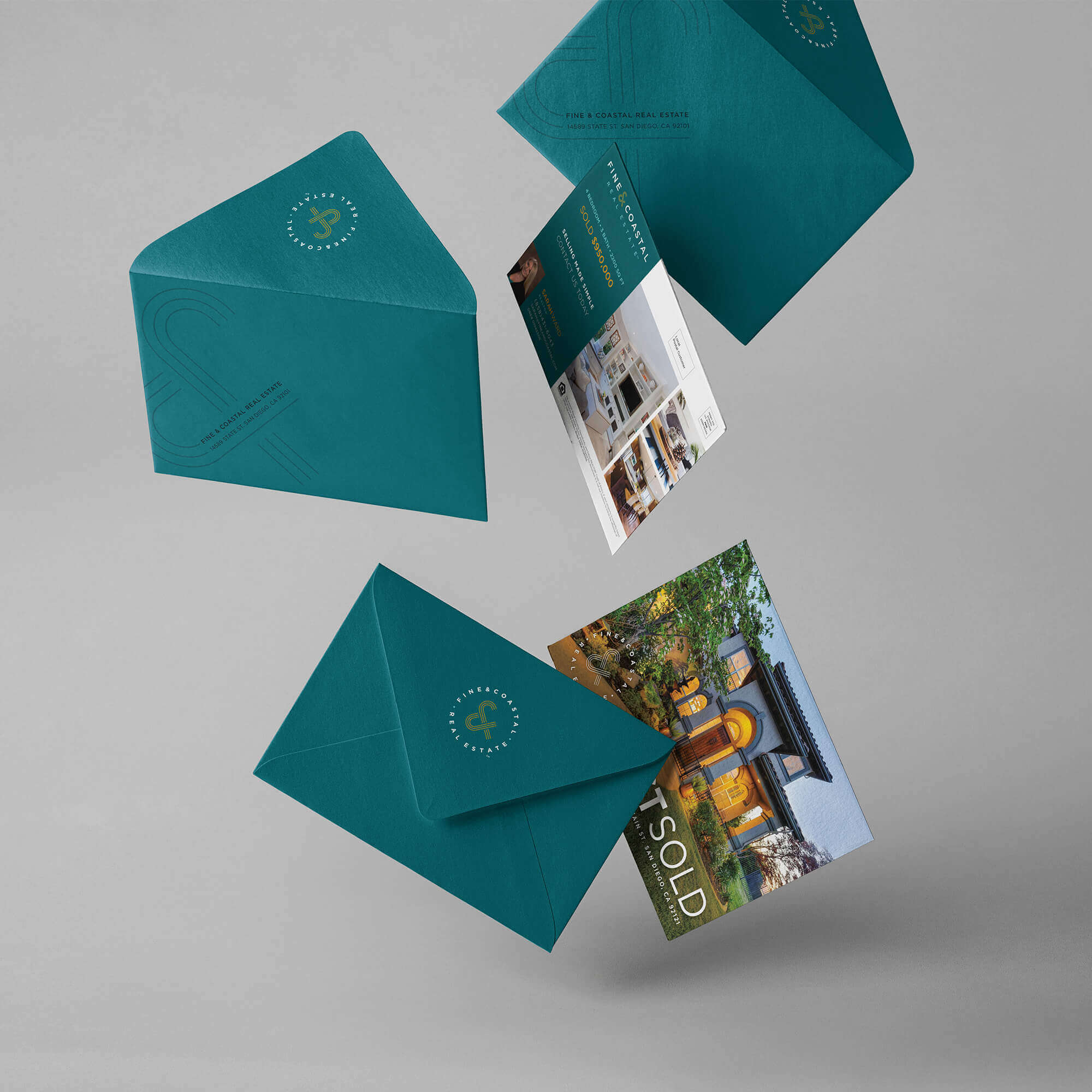
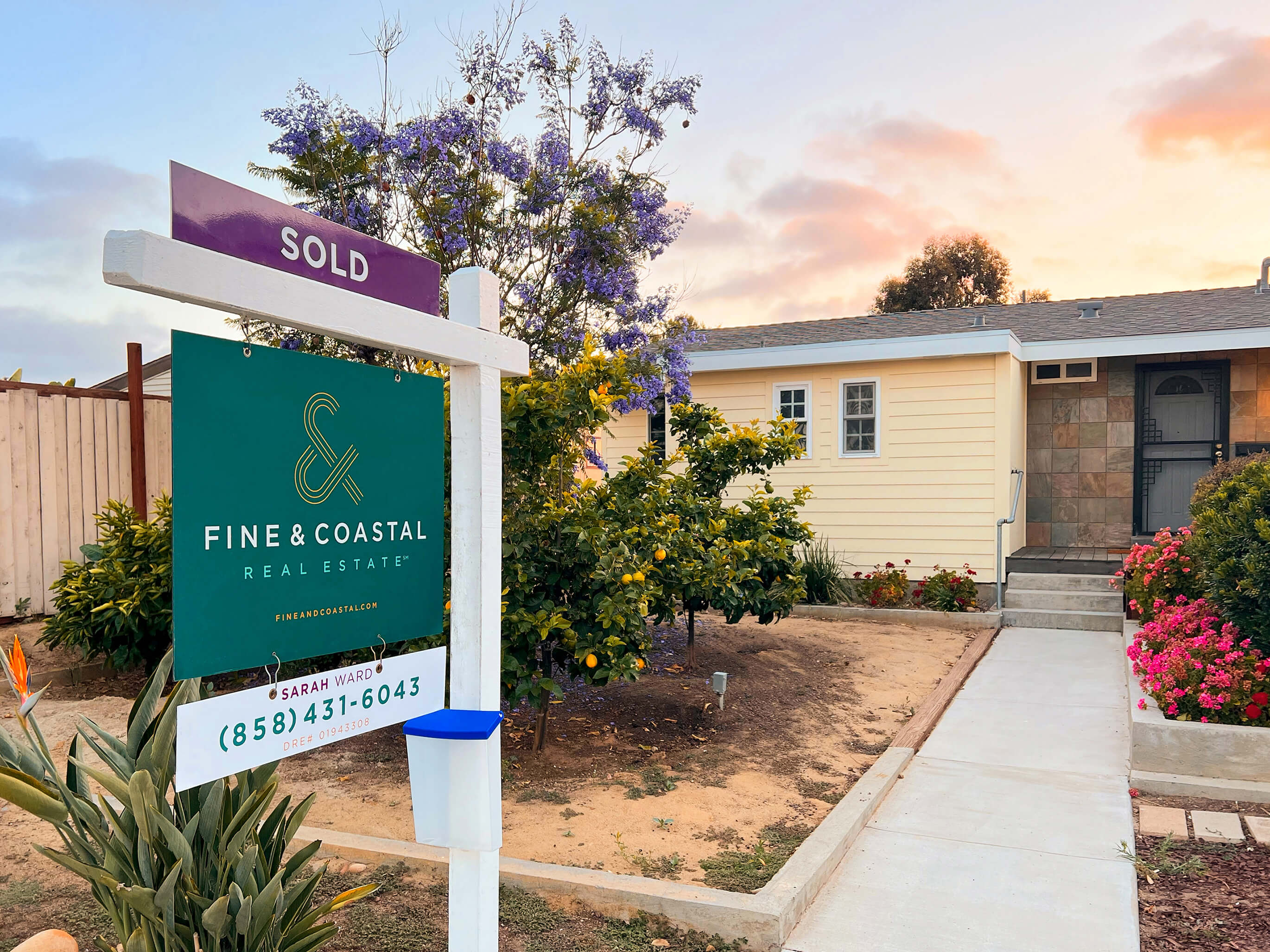
The identity extended into the everyday tools of residential real estate, from listing materials and marketing collateral to property signage. Each application maintained a recognizable brand presence while giving property imagery and information the space to remain the focus.